Taylors Wines. THE EXPLORER
Client: Taylors Wines
Role: Photography & Creative Direction
Scope: Brand campaign imagery
Deliverables: Still imagery for web, social, PR and marketing
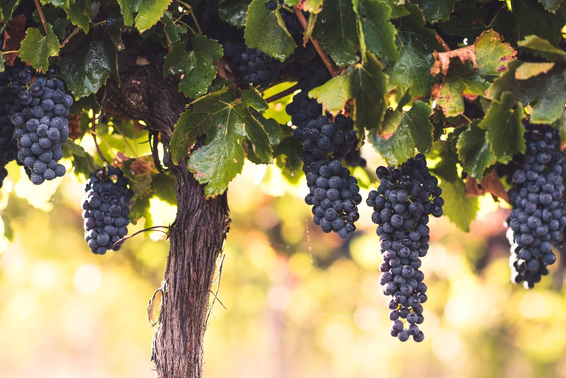
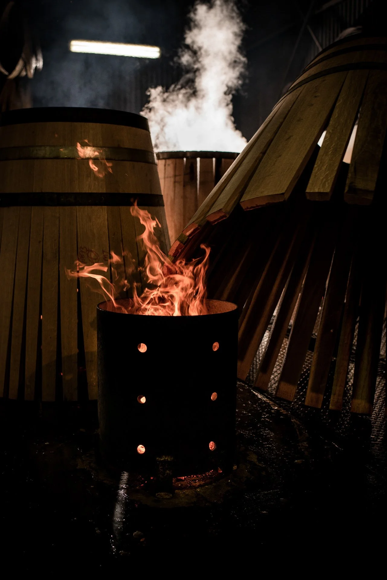
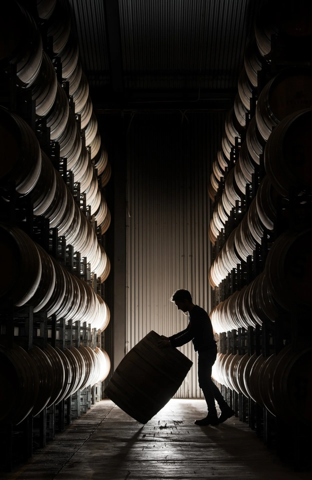
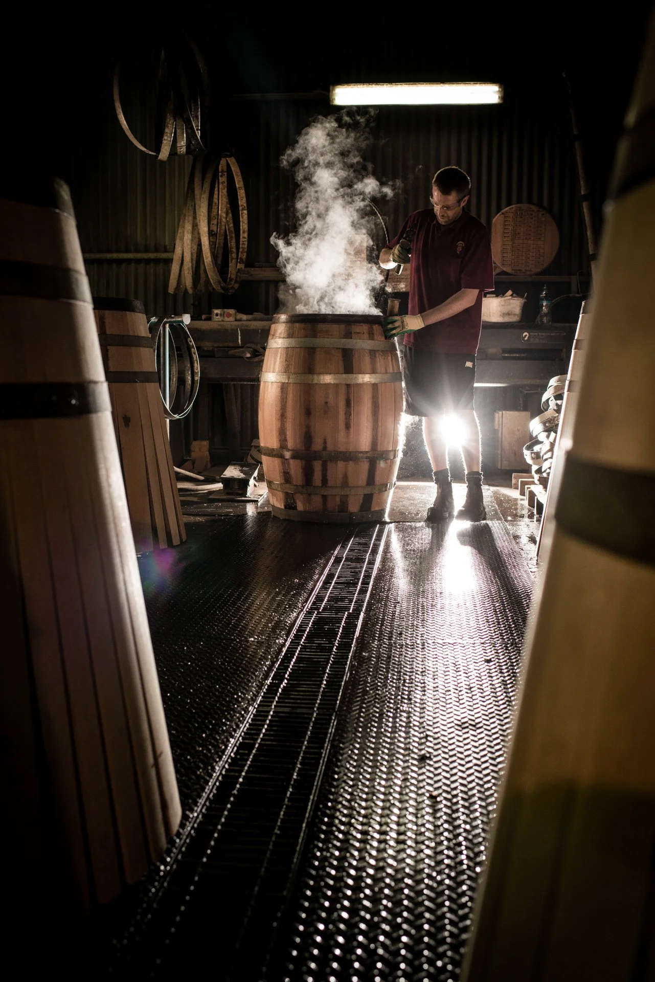
Location: Clare Valley, South Australia
2. The Brief
Taylors Wines approached the project with the goal of creating a suite of brand images that felt timeless, authentic, and emotionally engaging.
The imagery needed to honour the heritage of the brand while feeling contemporary and relevant to modern audiences, and flexible enough to be used across multiple platforms including digital, social, PR, and marketing campaigns.


3. Creative Approach
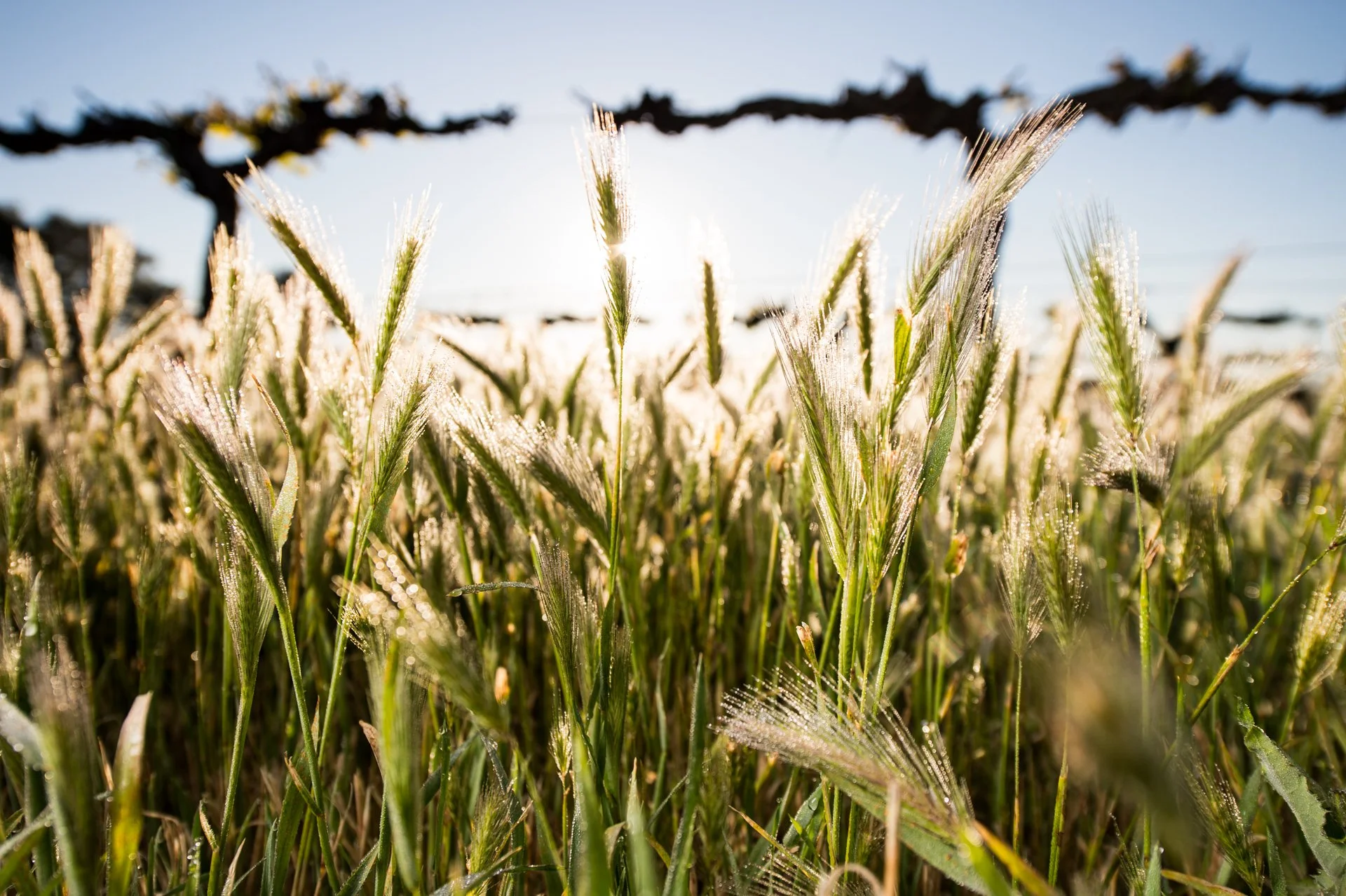
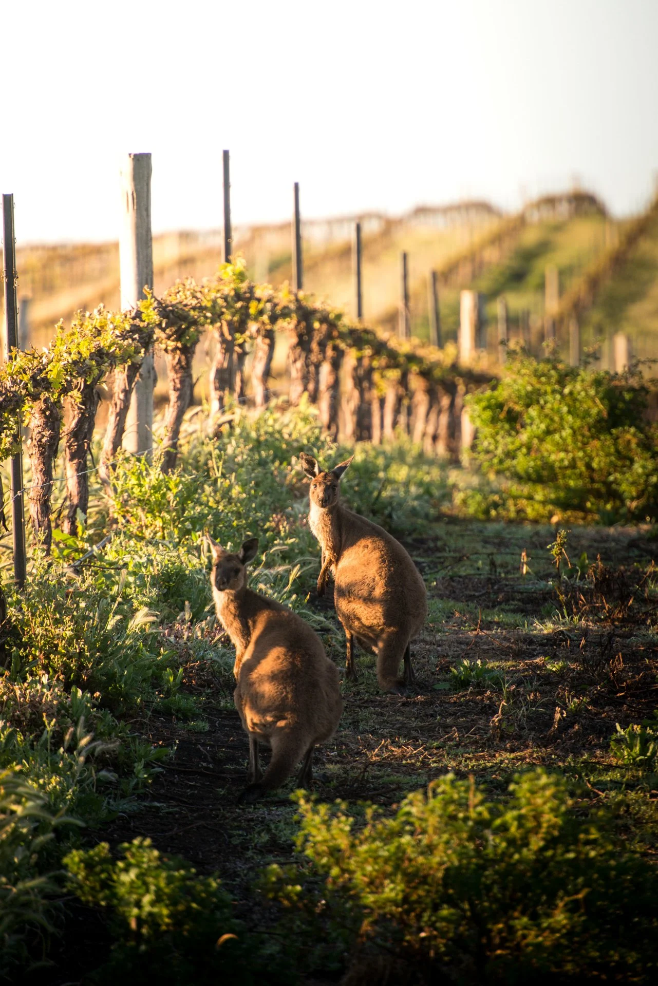
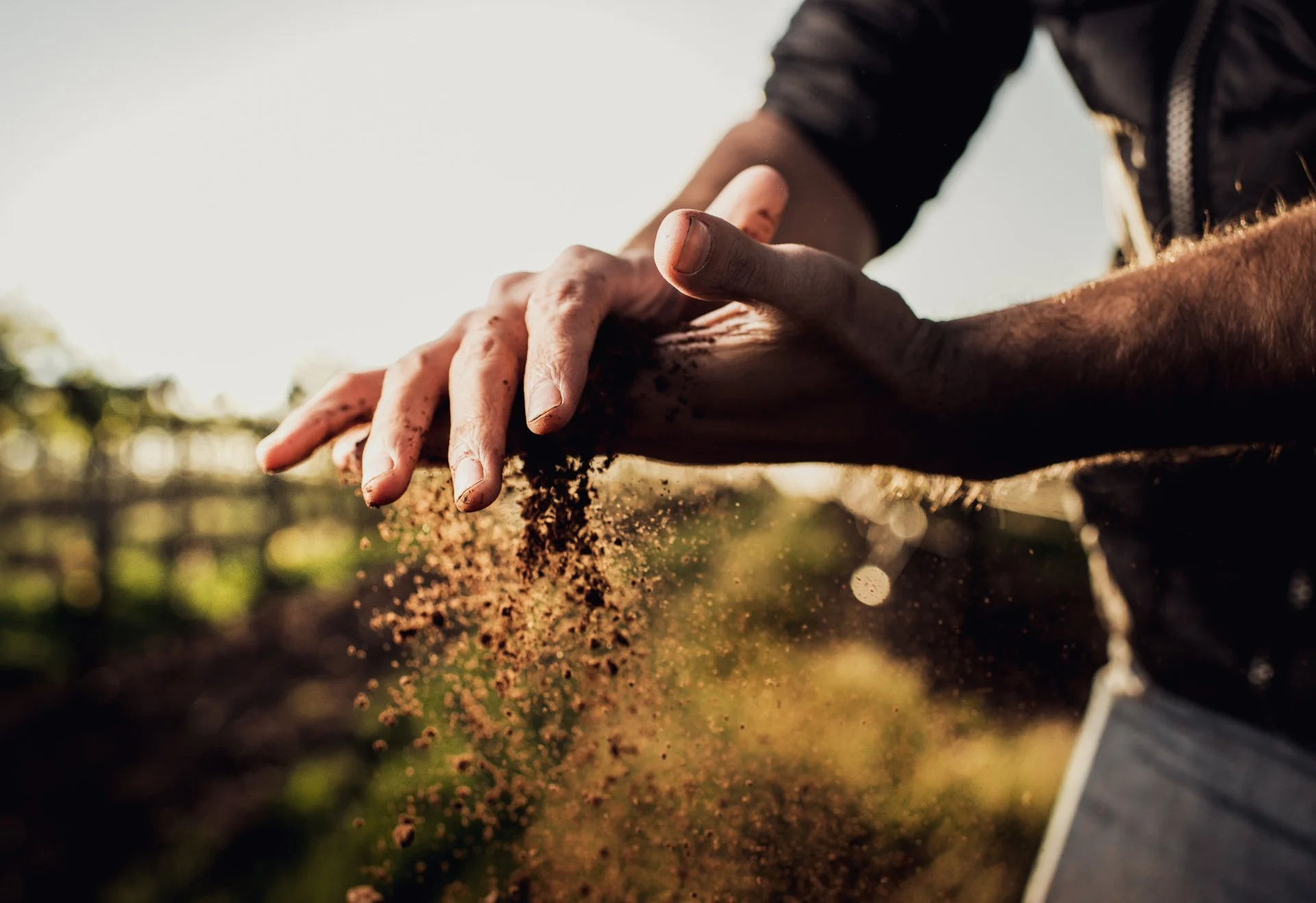
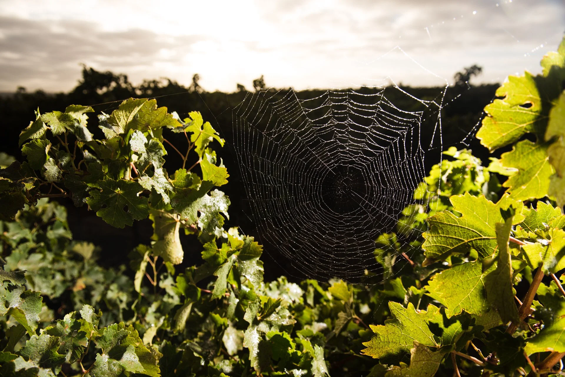
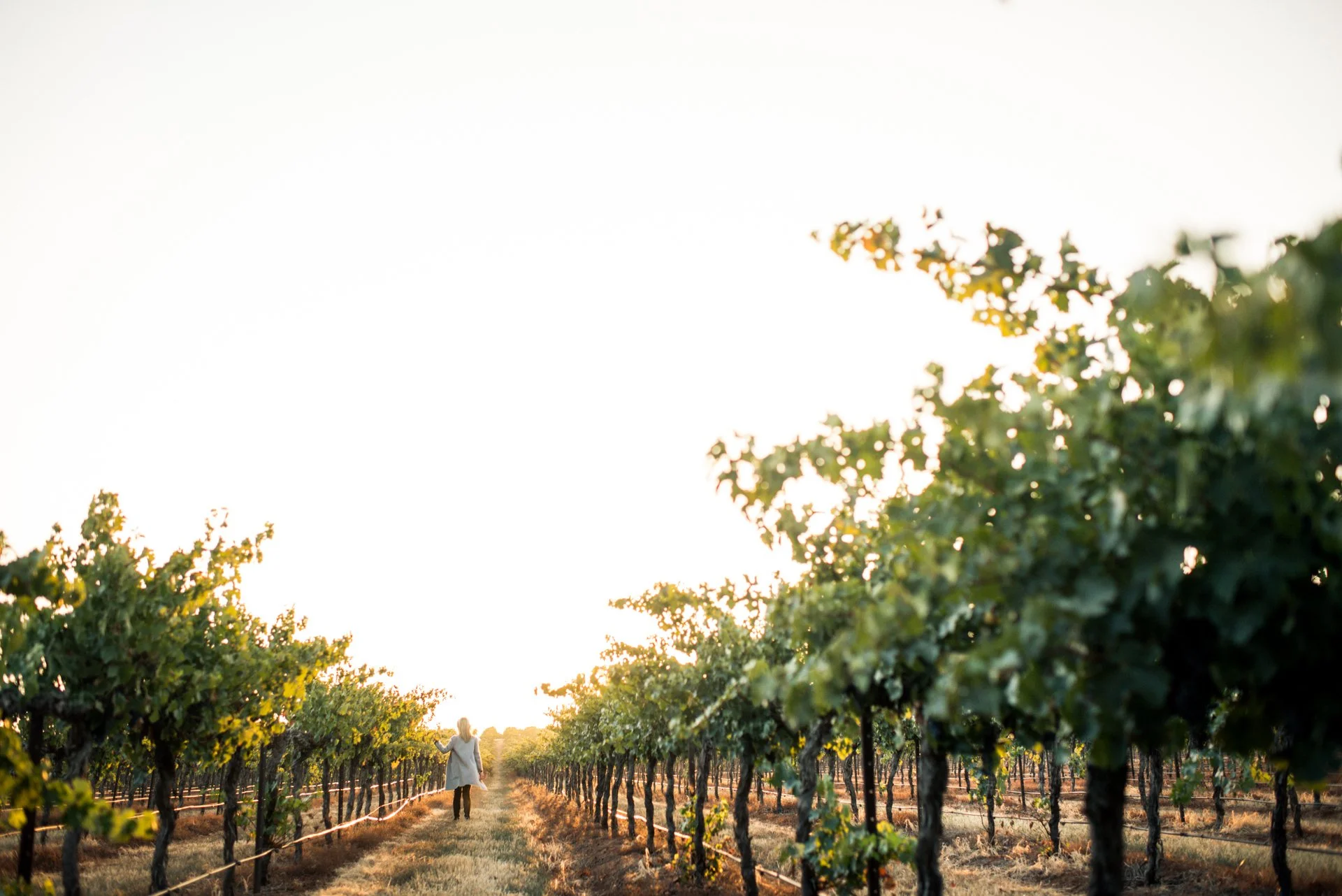
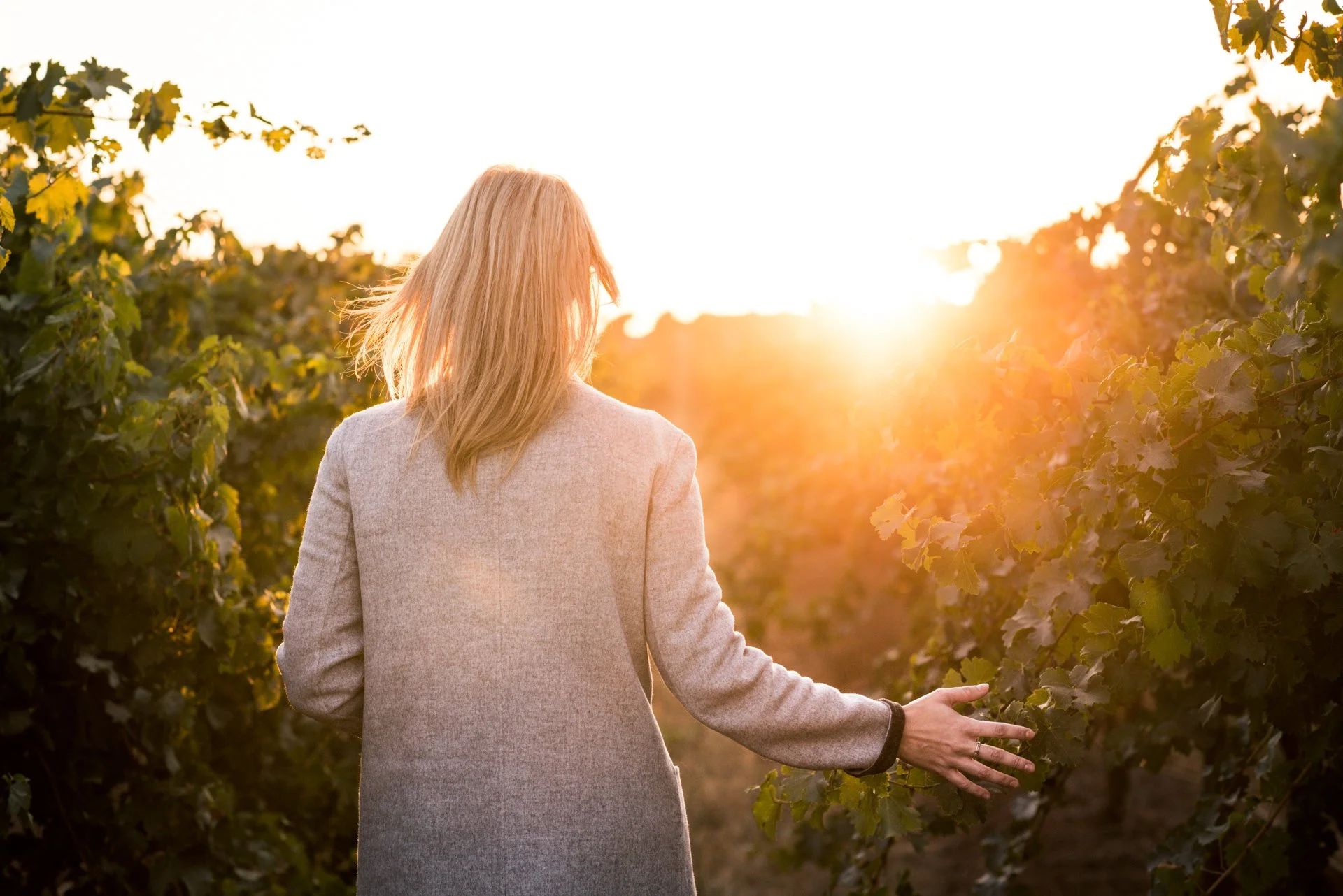
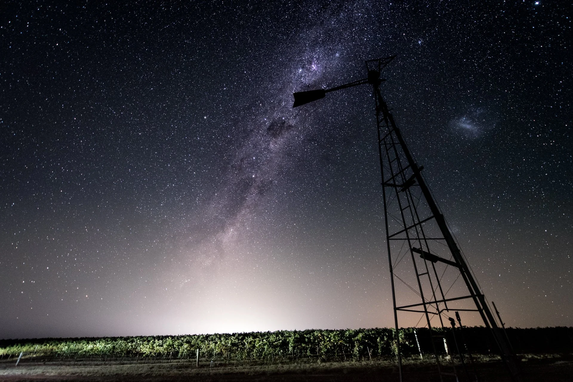
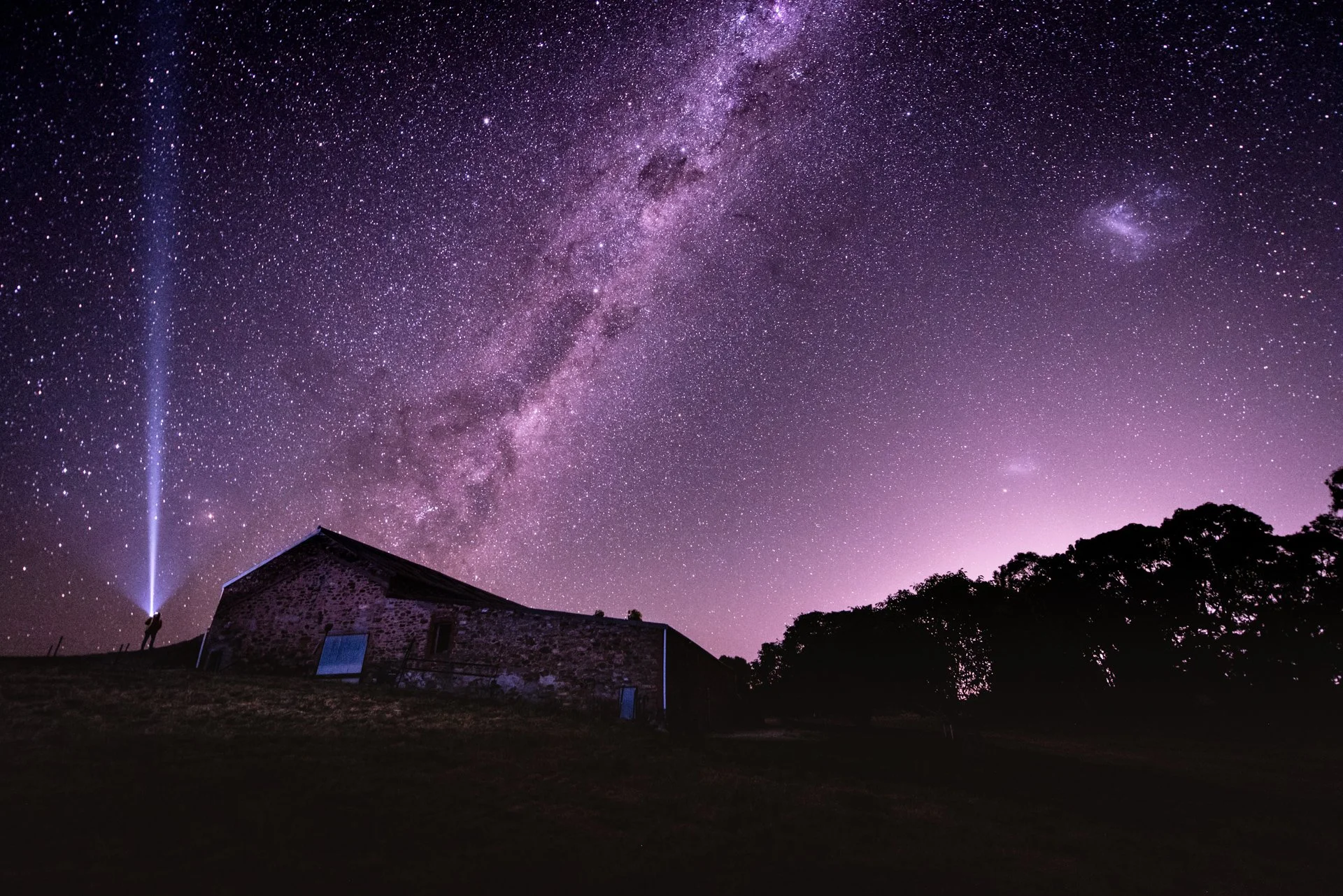
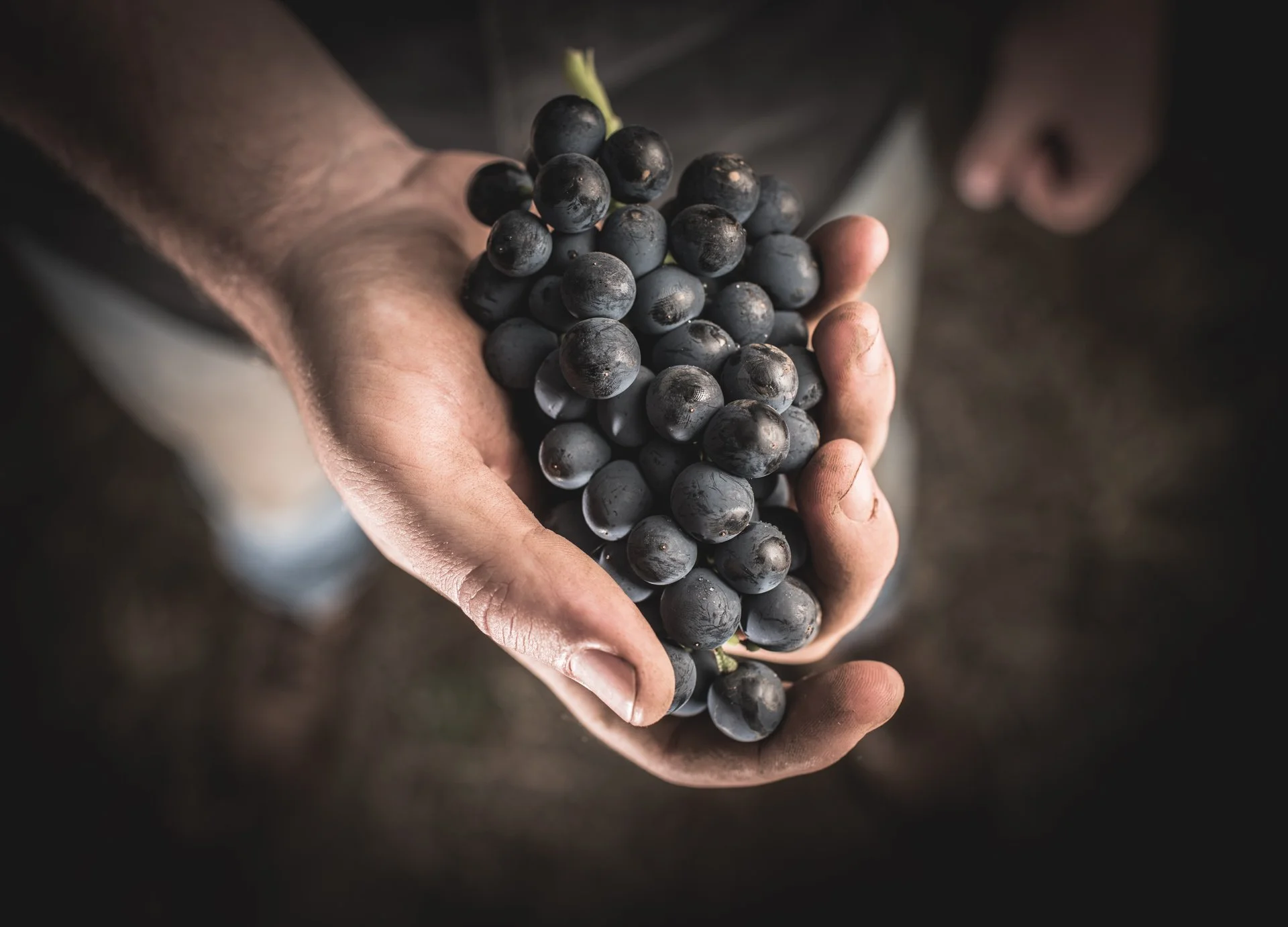
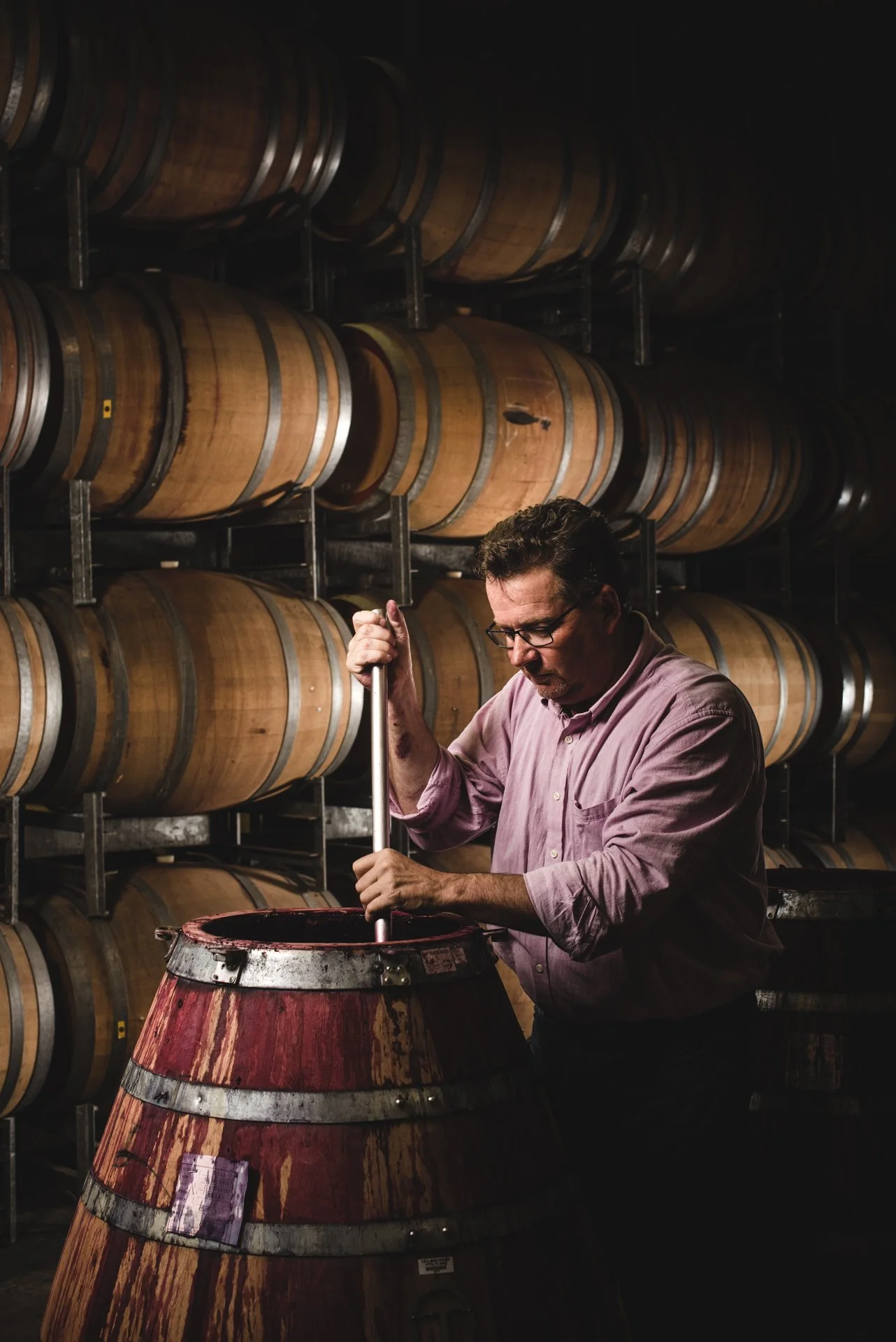
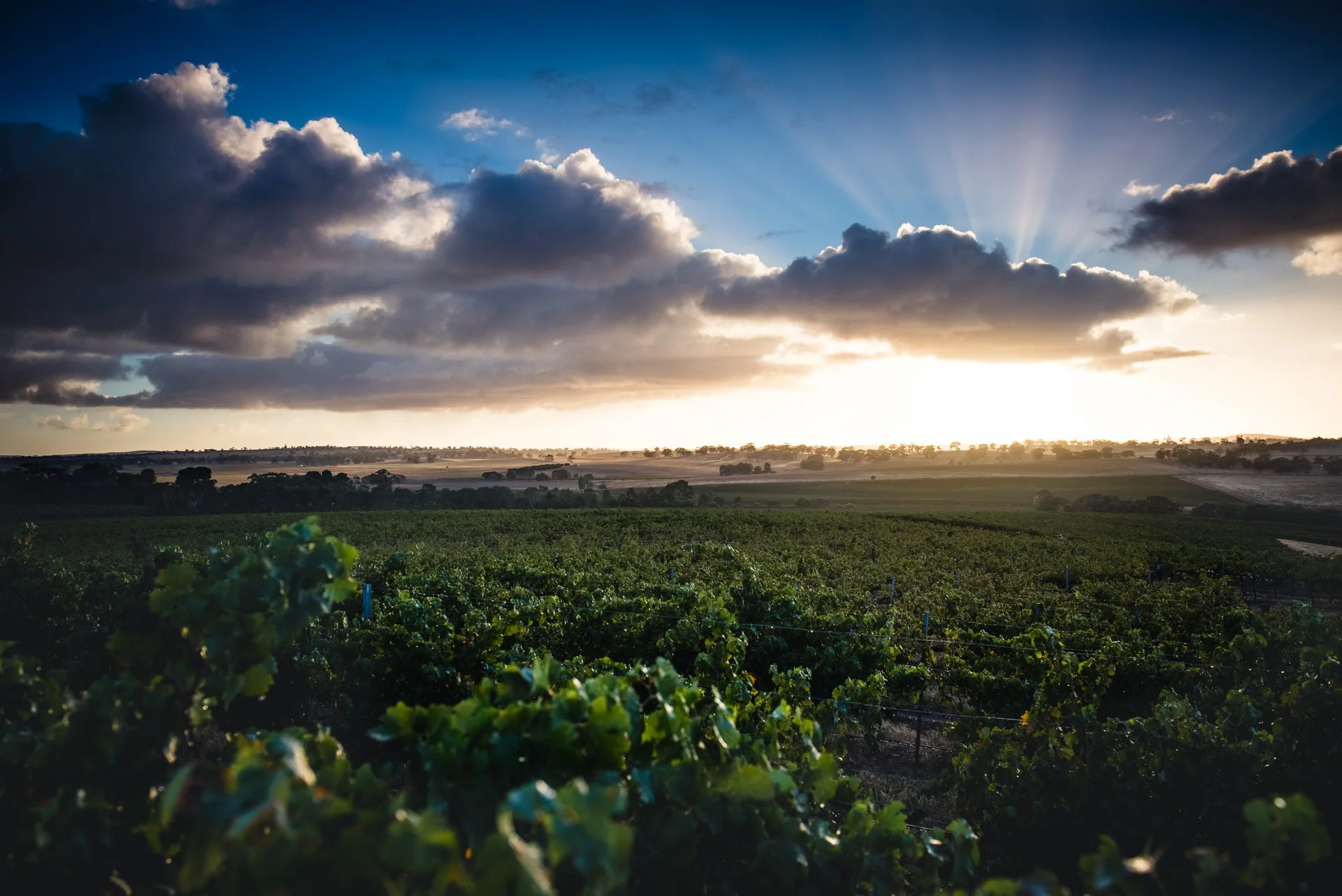
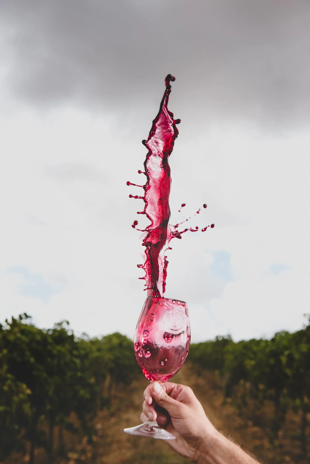
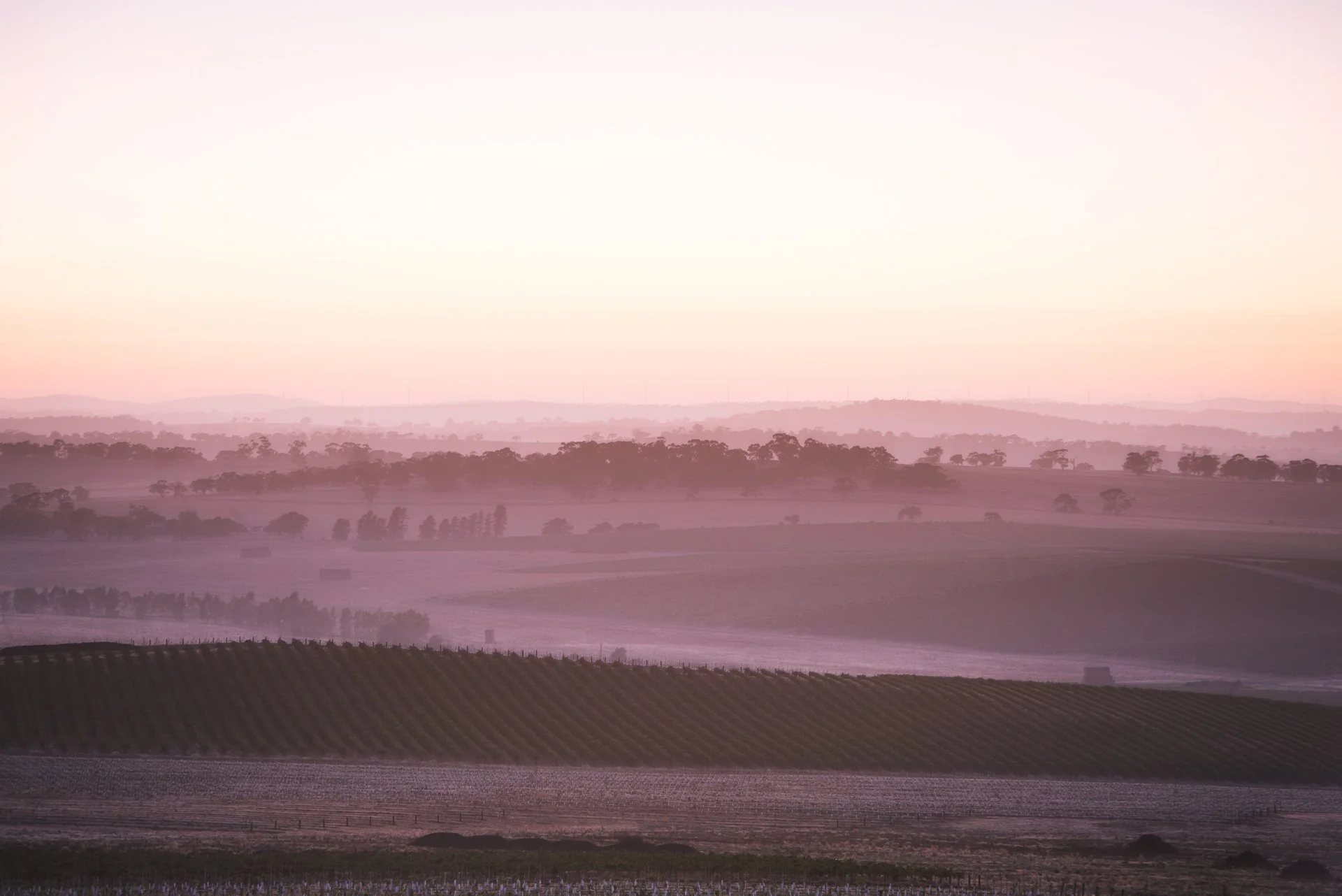
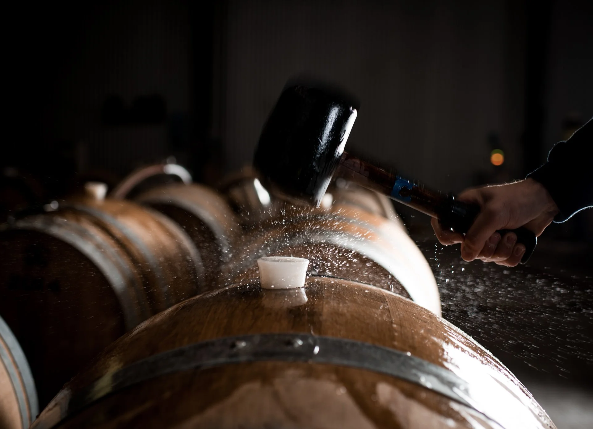
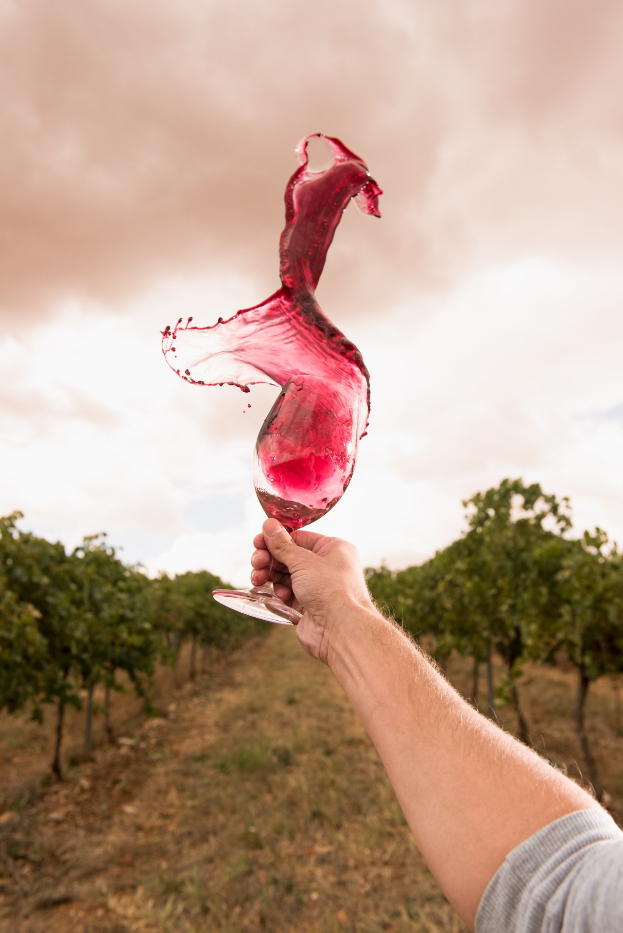
My approach was to create imagery that felt natural, honest, and grounded in real moments rather than overly styled or artificial scenes.
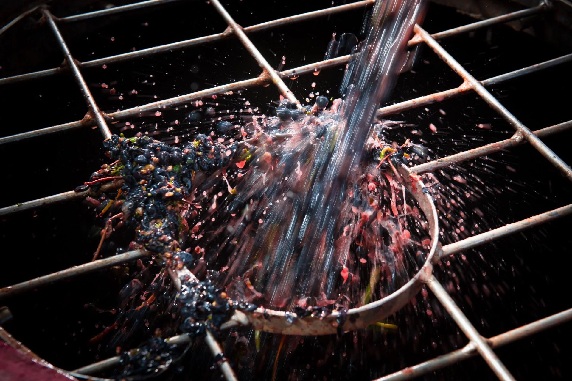
We focused on working with natural light, real environments, and seasonal details to reflect the authenticity of the Taylors brand and the landscape it comes from.
Care was taken to balance a refined, premium aesthetic with a sense of warmth and approachability, ensuring the images felt aspirational without losing their human quality.
KEY CREATIVE DECISION
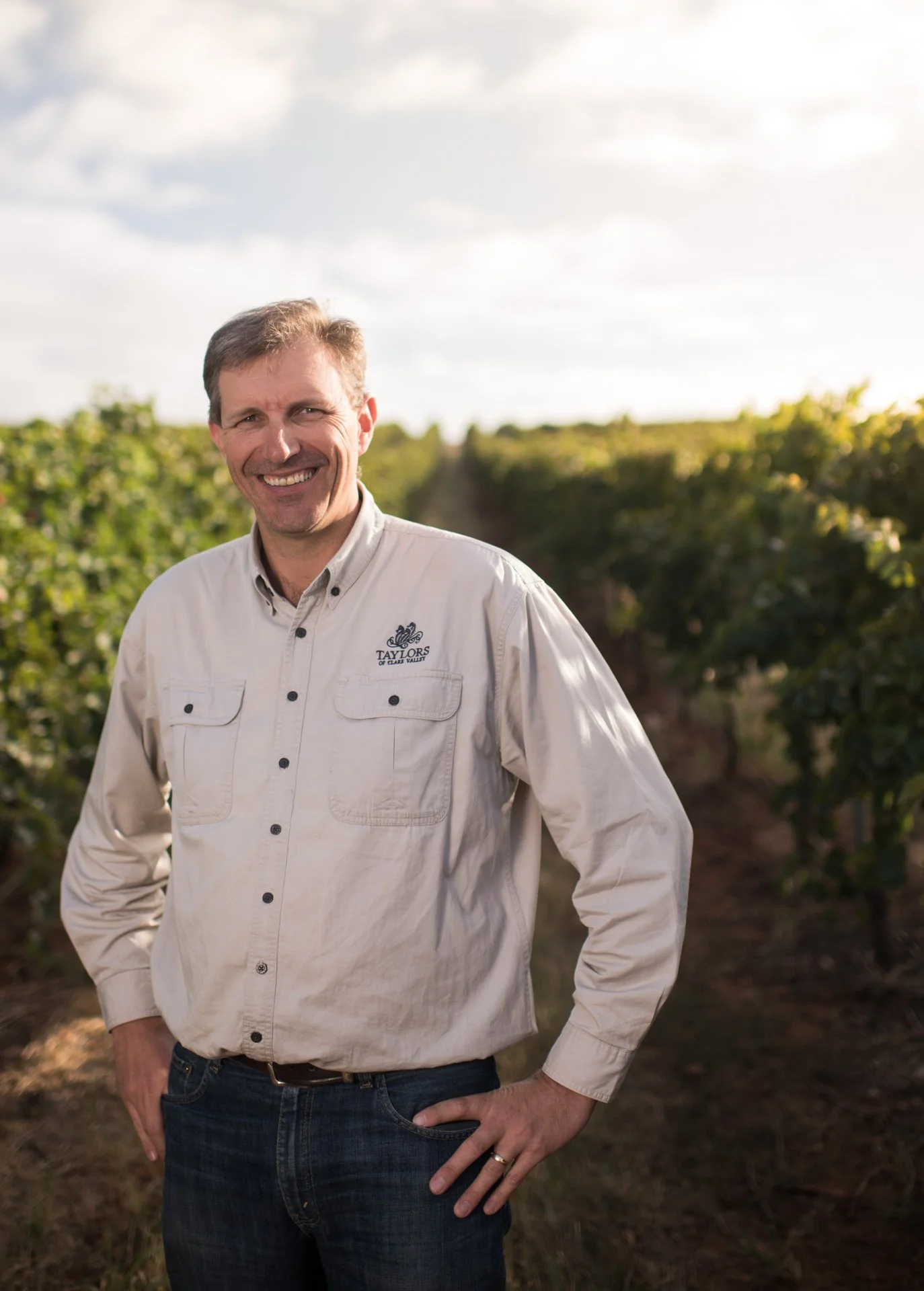
• Shot on location to maintain a strong sense of place and authenticity
• Used natural and directional lighting to create depth without over-stylisation
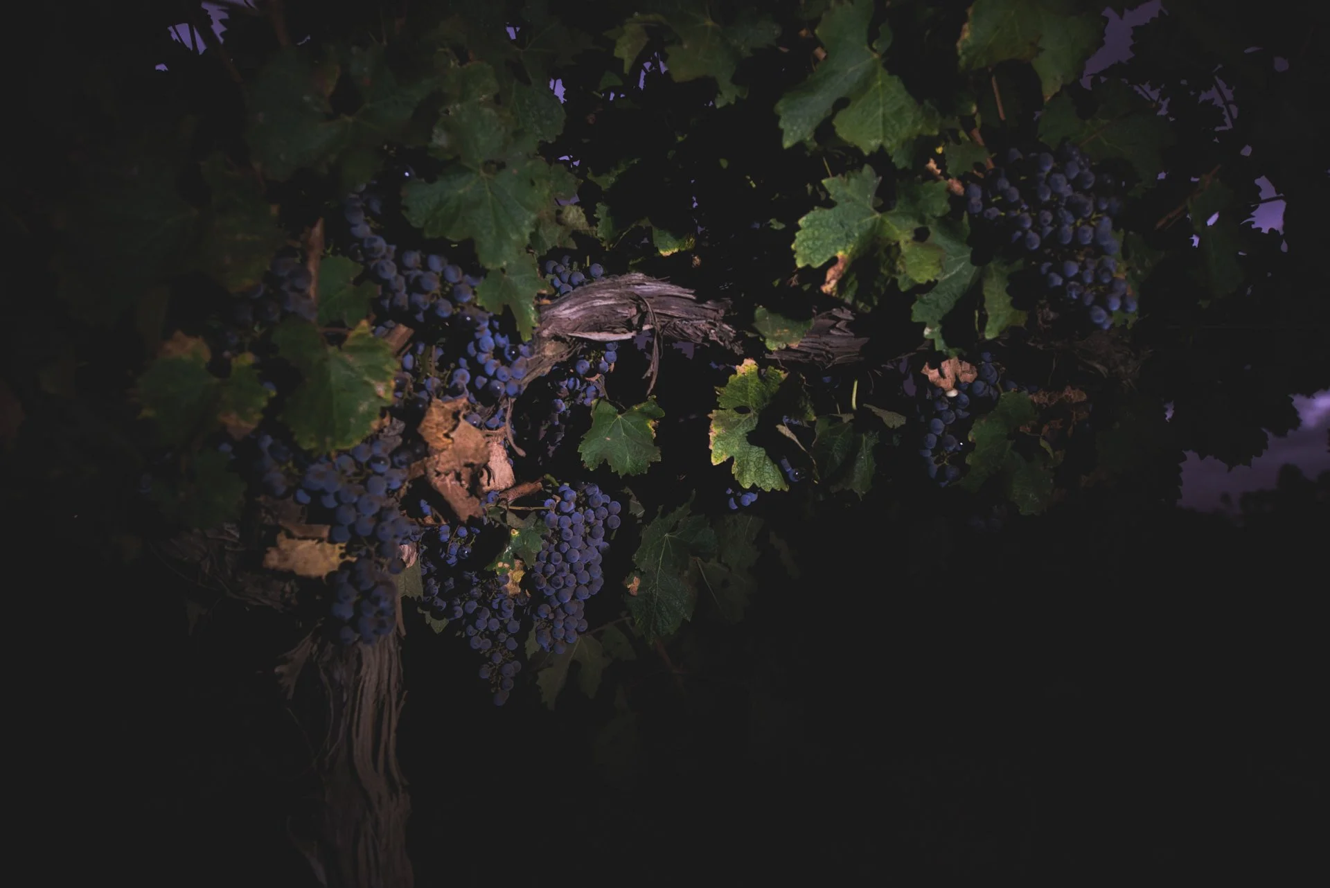
• Focused on seasonal textures, colour, and atmosphere
• Composed imagery with flexibility in mind, allowing for varied crops and usage across platforms


4. Role & Responsibilities
For the Taylors Wines campaign, I was responsible for the project end-to-end, spanning creative interpretation, visual direction, production, photography, and post-production.
Working closely with the brand’s campaign objectives, my role involved translating the creative intent into a cohesive visual system that could be applied consistently across multiple outputs. This included planning the shoot for efficiency, directing talent and styling on set, and ensuring the final imagery aligned with both the campaign narrative and Taylors’ broader brand identity.
This approach allowed the campaign imagery to function effectively across digital, social, and brand marketing channels, while maintaining a premium and contemporary aesthetic.
5. Outcome
The final image suite provided Taylors Wines with a cohesive and versatile set of brand assets that could be used across a wide range of channels.
The imagery has been used across web, social media, PR, and marketing materials, helping to reinforce the brand’s visual identity with a consistent and elevated look and feel.
The project was delivered on brief and has since led to continued collaboration and trust with the brand.
The Taylors team was thrilled with the final imagery. As Communications Manager Brian Olsen put it, "We ADORE them."
The images are now featured extensively across Taylors’ website, digital channels, printed marketing, and international advertising. The work continues to anchor their brand storytelling, offering a cohesive and emotionally rich visual presence.